From concept to launch Corsin Haus delivers high-end strategy, systems and foundational design support so users are always at the core of your product development. Let’s talk today about how we can partner with you to elevate your next product initiative.
AmeriHealth Caritas
Corporate Site Redesign
Changing the conversation about managed care.
Services
Introduction
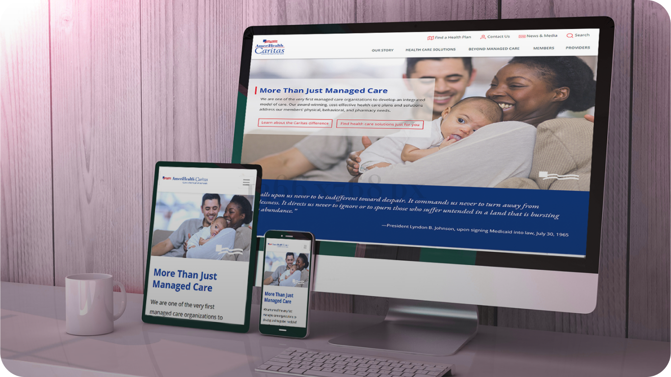
AmeriHealth Caritas is a leader in Medicaid managed care for the poor and underserved. As such their main corporate website needs to reflect their mission and their commitment to their members. This project redesigned their website to exemplify the human first nature of their brand.
The Problem
The critical challenge with this project was figuring out how to breathe new life into a digital brand that had grown quite stale while adhering to all myriad of legal and compliance rules associated with healthcare web design. The end result would need to be as close to AAA WCAG compliance as possible and copy on the site needed to be at a 4th grade reading level.
The Process
User Research — We started this project by collecting data from various internal stakeholders as well as members, providers, and state and federal government agencies. We used this data to create user stories and then combined that data with research on 508 compliance/accessibility and user centered design. We also established a consistent language and reusable code — including Bootstrap and SASS — so that all teammates were coding in the same way.
Branding — For this project it was crucial to create brand standards that were specific to our external web properties. While we maintained our corporate color pallet, we used Google fonts for typography and established rules to ensure that font and color pairings were used consistently throughout the site. Where appropriate, we added links to related articles at the bottom of the page so that users could read even more about the great work of the company and further reinforce our brand and values. We searched for new ways to apply the corporate brand colors by experimenting with our secondary palette in untraditional ways.
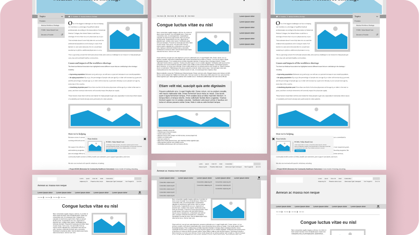
Wireframe — Because of our accelerated timeline, we actually skipped our initial wireframing phase and went straight to full color mockups. We came back and did some quick wireframing for our interior pages so that we could solve specific navigation issues. Traditionally, large sites like this have side bars to help make navigation to related sections of the site easier. We experimented with a few different placements to see if a different approach would better suit our needs. In the end we went with a version of the right side bar but used it only when needed in order to call out related content.
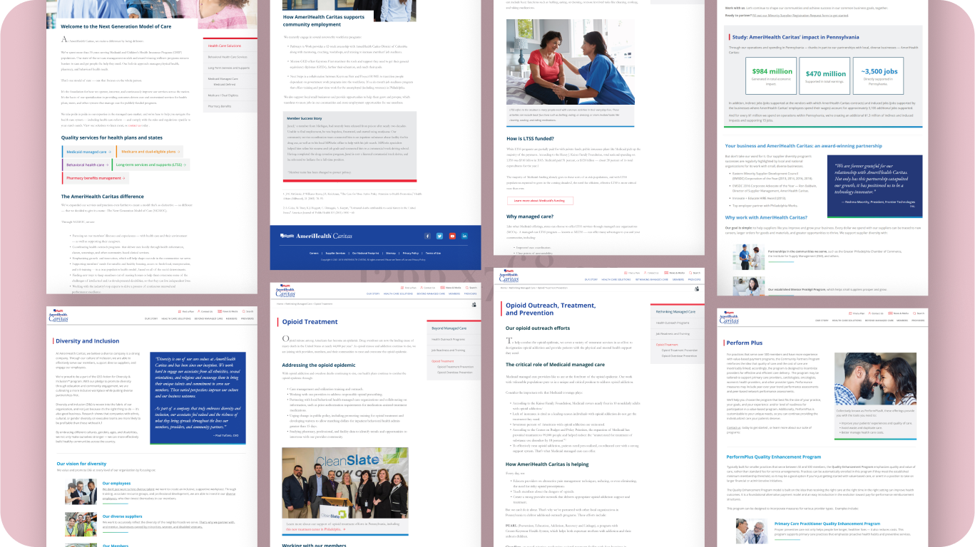
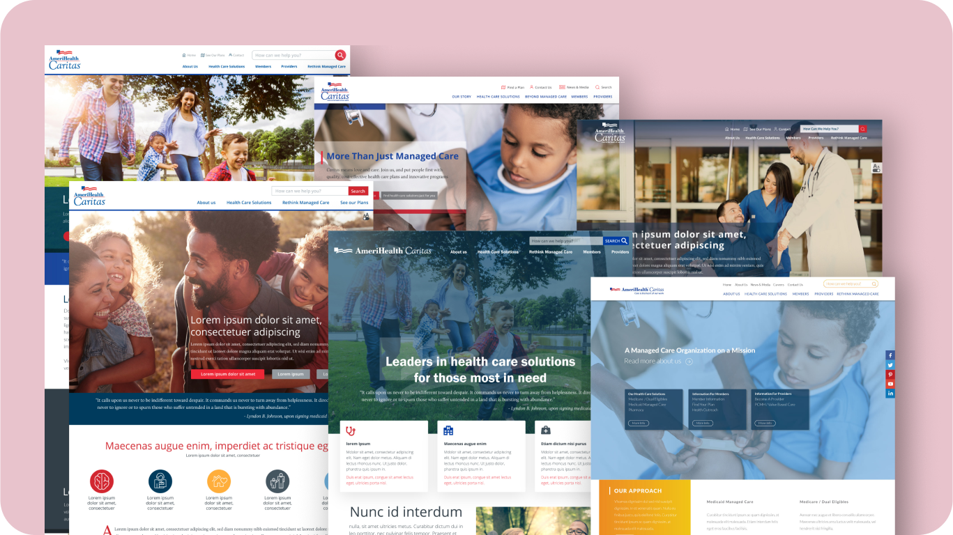
Mockups — Because we skipped wireframes for our homepage designs we instead drafted over a dozen different design concepts, exploring new ways to express our brand using flat design, large imagery and typography, video placements and improved concepts for search and navigation, as well as new approaches to color. This allowed us to position content in a way that would be most beneficial for users and stakeholders alike and to use animation and video to call out content that would have been overlooked in our older site designs.
Outcome
This project was a huge success. We increased user engagement by 125% and produced a large-scale, fully functional website in nearly half the time it would normally take to build a site of similar size and content. We completely revamped the language, look and feel of the site and employed modern web design techniques while remaining in compliance with various legal and accessibility regulations. The success also taught us a lot about balancing expectations from stakeholders while still creating an engaging user experience. My personal opinion is that skipping stages in the process was a drawback; I’m a firm believer in hitting all of the stages in the workflow even if you have to spend less time on them. Potential discoveries in the skipped wireframing stage could have reduced the number of repetitions we did in the mockup phase because our stakeholders would have approved the structure beforehand and we would have only been concerned with color, typography and branding in the mock up phase. Although there were things that I would have done differently, we still succeeded in our goals, which speaks not only to the power of perseverance and dedication to the end product, but also to the value of flexibility amid less than ideal circumstances.
Follow us: